Product Design and Branding of a Luxury Fashion Startup
The founders of vivrelle came to us with their idea for a subscription-based service allowing users to borrow and lend luxury handbags, jewelry and accessories via their mobile device. We were tasked with designing a brand identity for the new company and buidling the app that would build growth, facilitate the service and be the touchpoint for the company and its members. Here’s how we did it.
My Role
- Design Direction
- User Research
- Strategy
- UX Design
Team
- Kate Lechleiter
Designer (Brand, Art Direction, Production)
- Nick Spriggs
Design Management, Direction
- Hagop Kalaidjian
Photography
- Ben Smith
Technical Lead

Problem
A startup has a brilliant concept for a new subscription service and needs to brand itself and build a digital product to be the foundation of the company.
Starting from Scratch
When the founders of vivrelle showed up at our office for the first time, anticipation and excitement were at an all-time high. They had a brilliant model for a new social subscription service that would allow members to borrow luxury hangbags, jewelry and accessories at a sliver of the cost of ownership. We were going to make luxury good accessible. The working professionals of New York want to impress with a seemingly endless collection of luxury items but won’t always have the cash – or the closet space – to own them. The idea sounds simple enough but when one starts to consider the acquisition and refurbishing of luxury pieces it gets a little more difficult. Vivrelle had a solution to the logistical side of the company and a great business plan, but was in need of everything on the design side.
Through our initial conversations we agreed that the brand design and the product UX should not be done in silos. It is my belief that the UX of a product is the brand (or at least a substantial part of it) and that the brand design must be done in synchrony with the product UX design.
An early user flow diagram designed in Sketch quickly transforms into a useable, shareable prototype. Building our flows and wireframes in Sketch allowed us to iterate faster, collect better feedback and have a shared understanding of ideas as they were implemented. Wireframes could increase in fidelity every sprint. Upon seeing the success of this method, our entire team adopted it for future projects.
Interviewing Stakeholders, Defining the Problem and Finding a Deep Understanding of the Product Vision
Like many startups, the founding team was small and felt aligned on most things. The key word here is “felt” – they thought they were aligned but as we listened during early discovery we began to notice small discrepencies. We knew that we would need to fully understand the vision for the product and brand and need to flesh out the details. We also predicted that as we would grow to understand the product, we would help the owners of the product to better understand what they were building – to come into true alignment on every aspect of it.
We broke down our discovery phase into three parts:
- individual interviews with each stakeholder where we collected their ideas, opinions, priorities and vision for the product
- competitive research, designing user personas
- a design workshop with members of our design team where we could challenge ideas and assumptions and find areas of “productive conflict” between stakeholders
Designing Unique Workshop Exercises to Create "Productive Conflict"
Our design workshop had a number of exercises designed to uncover ideas that were either half-formed, misunderstood or missing entirely. One brand-visioning exercise I designed specifically for this client used was a kind of language prioritization game to help us find that productive conflict. Each participant was given a small stack of index cards and instructed to write one word per card: an adjective that they felt best describes thier vision for the brand. Once each participant had written a half-dozen words, we spread them all out on a large table and had the team walk around the room reflecting silently on what others had written. Next, we instructed the group to take turns selecting a card from the table and sticking it to a giant spectrum we created on the wall. On the left side of the wall was “more” and on the right was “less”. We asked the participants to prioritize the card they selected against the others on the wall. We told them the first card they selected could be their strongest from their own cards, but each subsequent card would need to be one that someone else wrote.

A brand visioning exercise I designed to help us find the true brand language and align stakeholders.
The goal of this exercise was to help us hear the kinds of words used in the brand vision. More importantly, it forced both our teams to have frank discussions about very specific ideas about what each word meant and how that fit into the brand vision. It was not the exercise itself where we find the most insight but rather it is in the discussion which follows the exercise.
In the days following the design workshop, we compiled our findings and presented these back to the client team. Our intent was not to dictate what the brand would be but instead to confirm that we had all together and come to a place of deep understanding about the vision for the brand at this stage.
“It was clear from our research that this needed to be a truly mobile-first product.”
Conceptual Design
Our team started on designing a set of concepts for the first phase of visual design. The purpose of multiple concepts is to push the acceptable boundaries outward and in some cases go too far. Going too far allows us to be sure we’ve gone far enough. It also allows the stakeholders to see different interpretations of the brand vision. This is not so that they might choose their favorite but rather to be confident that they have found the best possible concept for thier brand.
The process of conceptual design is one of expansion and contraction. We begin with broad strokes and no boundaries at all. Then we refine our concepts, looking to categorize thematically. This is done repeatedly, back and forth again and again, expanding on our themes and contracting the scope until we have synthesized a set of unique concepts which can be identified by their theme.
A range of conceptual designs was presented to test the boundaries of our expectations and to find the right aesthetic to match our brand vision.
“The process of conceptual design is one of expansion and contraction... back and forth again and again, expanding on our themes and contracting the scope until we have synthesized a set of unique concepts which can be identified.”
Brand Refinement, Product and UX Design
We had defined the brand vision and selected a concept to pursue further and we were simultaneously beginning UX design for the product. Our brand mantra was “coveted living” and we looked to embody this in both our visual aesthetic and the user experience.
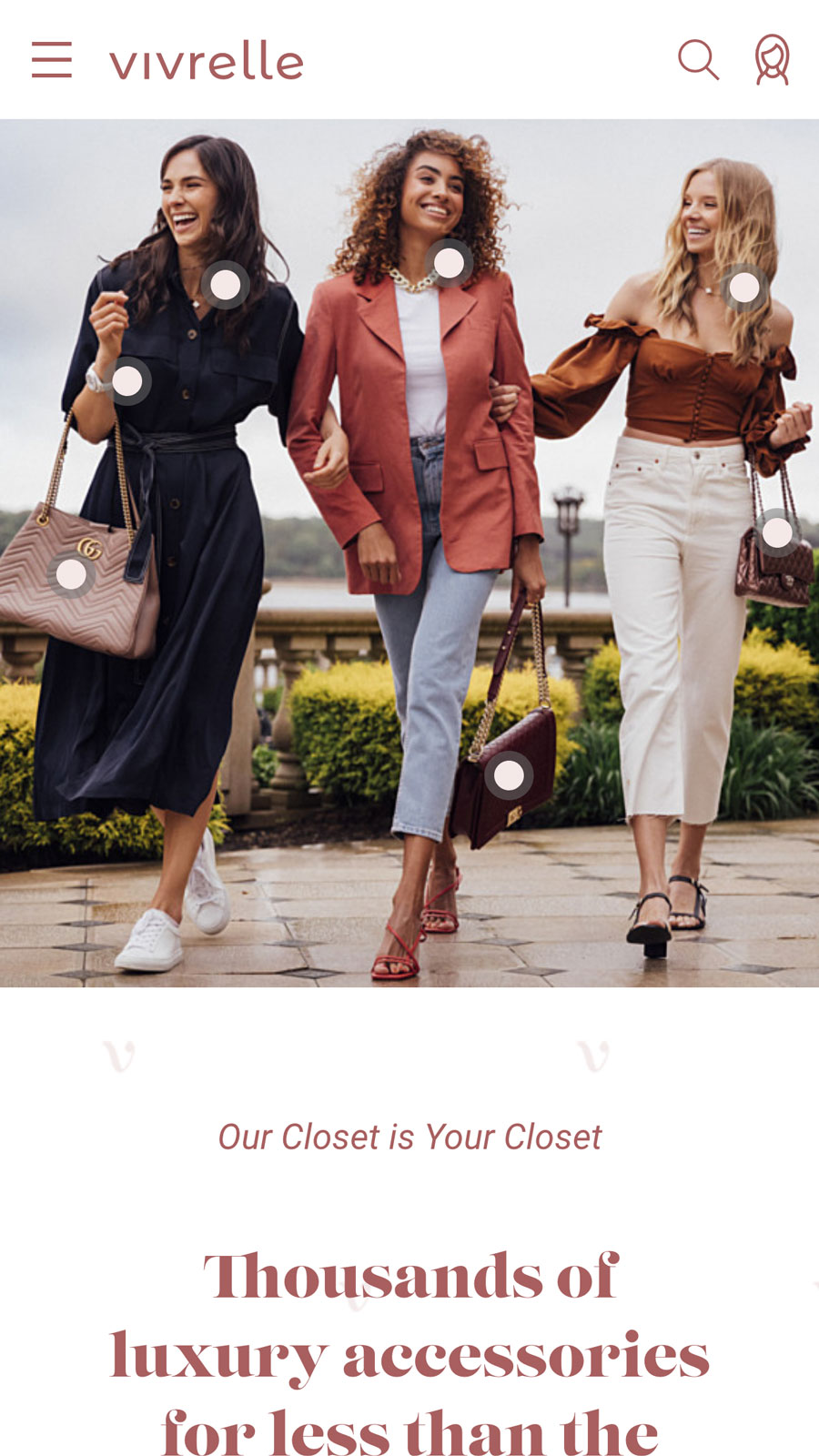
We had commissioned the artist Hagop Kalaidjian to produce new photographs that were a mix of fashion and lifestyle blogger with actual products available through vivrelle. This allowed us to create a “shop the look” UI feature on the homepage. Users could see this high end lifestyle fashion photograph, and the shopping-style interaction hinted at an idea of “this is luxury, but accessible.”
The sign up flow was built around our brand mantra as well. This was to be an exclusive club. Signing up wasn’t “Sign up.” It was “Apply for a Membership.” Someone at vivrelle would review every application and approve you if you fit the bill. Our target was fashion bloggers and influencers, famous or burgeoning.
Our mobile UX took priority over larger devices. The homepage UI features dots that all users to browse products directly from the fashion-lifestyle photographs. Unique, creative filters inspire users to explore the catalog. The Application flow is designed as an onboarding experience to an exclusive membership club.
Finding New Problems to Solve
Early on during research, I identified a problem: the service would require time to scale as there could not be an endless supply of products for borrowing. The client assured me they could acquire inventory very quickly, faster than anyone else in the space. While that is true and may sound good, there is a big difference between scaling up “quickly” and scaling up immediately. When a local fashion writer blogs with a huge following blogs about the amazing new luxury bag and jewelry subscription service, we could see tens of thousands of signups within 24 hours – all of them expecting products faster than they could be acquired. I recommended a solution: we should limit the number of signups. This would fit nicely into our brand position as “exclusive” and help to solve a logistical problem. At the same time, we want to be able to scale up in a controlled manner, so we designed a function into the backend that would allow the company to “release” new memberships. On the site, we designed the signup flow to be an “Application process” that puts you on a waiting list – an idea we took from other elite NYC membership clubs.
We launched vivrelle in September 2018. Less than two years after launch, the company is seeing consistent monthly double-digit growth.
I’m on the lookout for my next team.
Let’s chat.