Building
Consensus
Across
Teams
At the most prestigious law firm in Silicon Valley, a designer's voice is far from the loudest in the room. How might we rebrand in a way that speaks the visual language of the region while retaining the historical stature demanded by the senior partners? How might we inspire the minds of the world's most innovative people? More importantly, how might we get hundreds of stakeholders to adopt our new brand direction?
My Role
- Interviews + Research
- Discovery Workshop
- Identity + Branding
- Modular System Design
Team
- Nick Spriggs
Design Management, Team Leadership
- Kate Lechleiter
Additional Brand Design and Specifications
- Jaime Patino-Calvo
Additional Conceptual Design
- Sarah Carr, Project Manager

Problem
A famous Silicon Valley law firm needs a site that speaks to its innovative work and ever-growing library of longform content. The firm wants to get in step with its clients – the most innovative companies in the world – but not everyone wants a rebrand.
Branding a Silicon Valley Giant
Wilson Sonsini is truly a part of the history of Silicon Valley – there is hardly a recognizable name in the region that doesn’t have some connection to the firm. This was the firm that represented Apple during its infamous IPO. Advised Google on its IPO. Represented LinkedIn’s $26B acquisition by Microsoft. These are historic events and we wanted to draw attention that, but we also know that Silicon Valley is all about the future; the leaders of the “new.” Our brand mantra was “sage pioneers” and we found strength and inspiration from the tensions found there.
We opted to hold our discovery workshop and a follow-up session at the client’s Silicon Valley headquarters. This allowed us to get a deeper understanding of the true atmosphere of the office. We knew we could be more comprehensive in our research, including voices from marketing, internal design, legal, corporate, outreach and recruiting.
Brand Positioning & Identity
Wilson Sonsini was known as Wilson Sonsini Goodrich & Rosati until we came along. In all our interviews, research and discussion, not one single person ever used the full name. We heard “Wilson” and we heard “Wilson Sonsini”. Knowing what we know about brands, we took a risky shot and recommended a name change – if not a legal one, a cultural one. This was not a complete leap as our research indicated this was already in place colloquially.
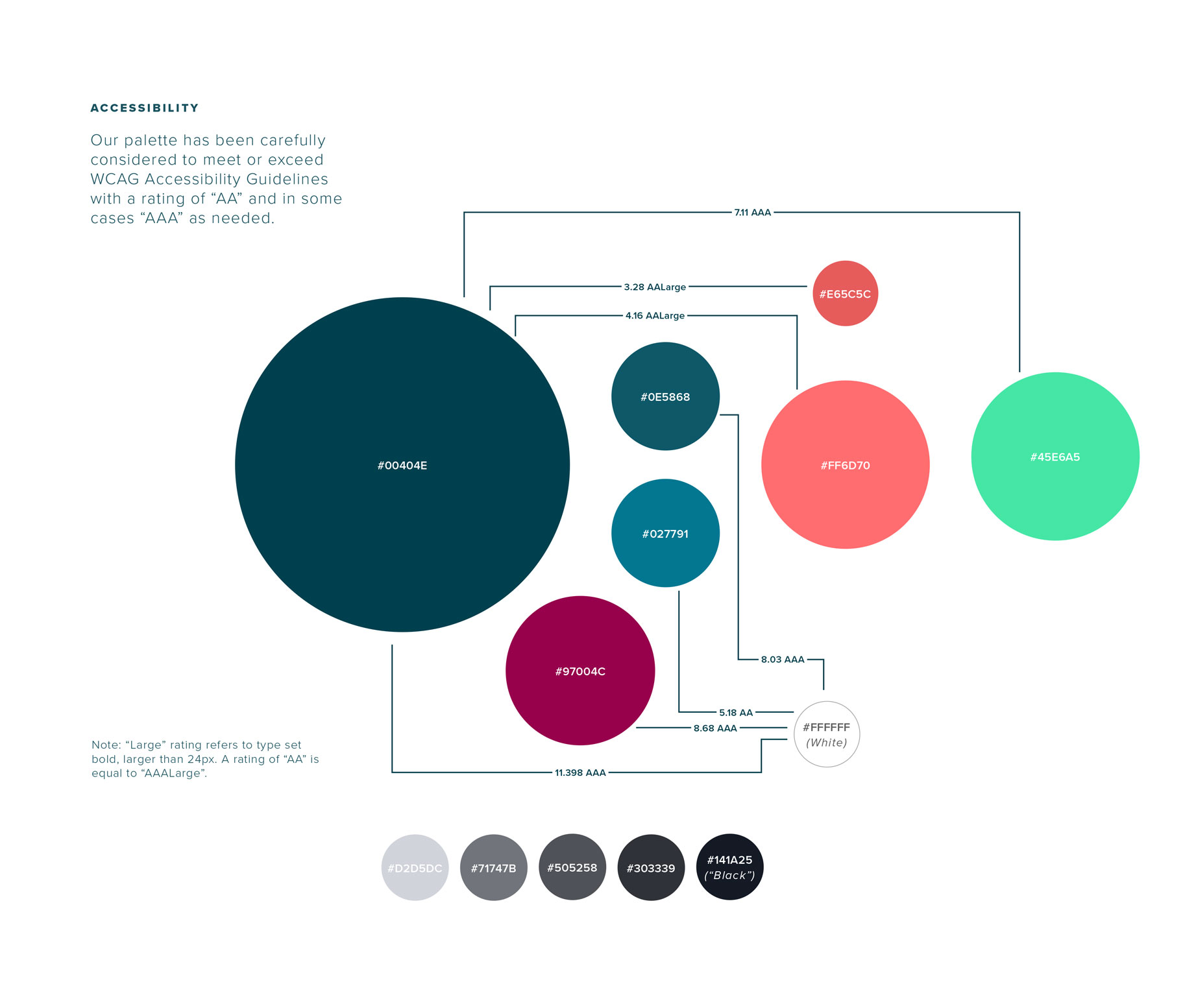
A major concern was the expectation of formality on different types of documents – for example, marketing materials to students compared to a legal brief. We designed a flexible identity system to address this need.
Conceptual Design
A selection of initial concepts designed to understand the company's appetite for change.
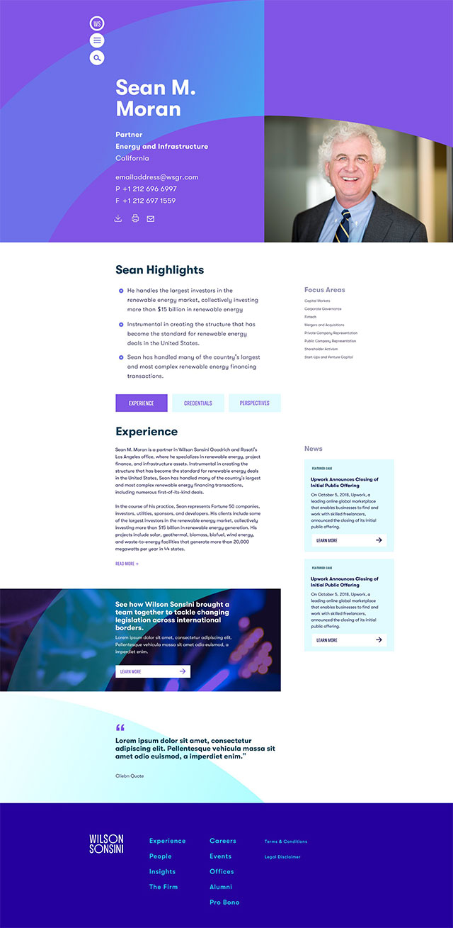
The selected concept was titled papers
, an aesthetic nod to the traditional legal document and the historical relevance of the firm. Angular elements, color bars, specific typographic treatments and photography were part of the design system to create the personality of the brand.
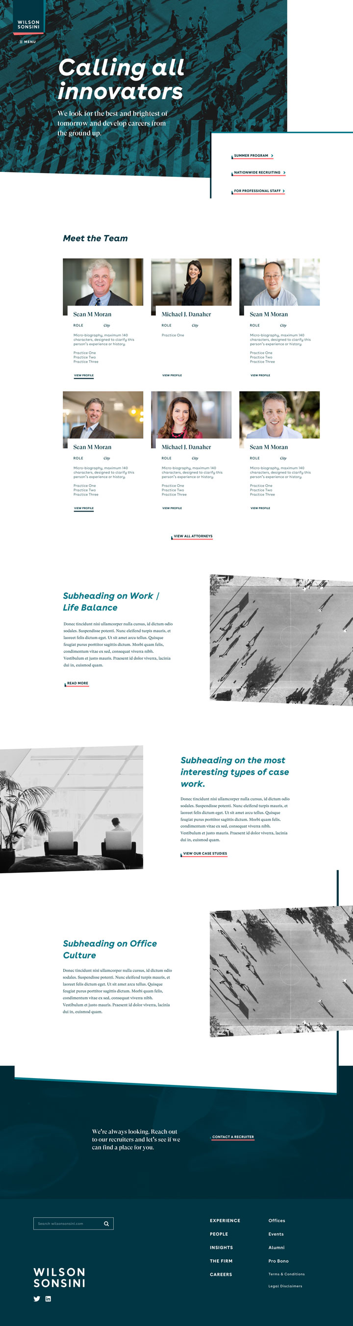
By designing a modular system in Sketch we were able to quickly prototype navigation concepts with real structure that stakeholders could review and test themselves.
Designing with real content and rapid iterating of navigation and modular content allows for a real experience for stakeholder reviews and user testing.
In 2019 the site launched along with the rebrand. Wilson Sonsini’s internal marketing team presented the new brand and site to the company, and we were happy to see it adopted emphatically by their employees, from the graphic designers all the way up to the executive senior partners.
I’m on the lookout for my next team.
Let’s chat.